TANDEM DISPENSERS
year
2018
client
CASCADES
Services
Industrial design
Strategy
Mechanical engineering
Prototyping
Prix
Good design® award 2019
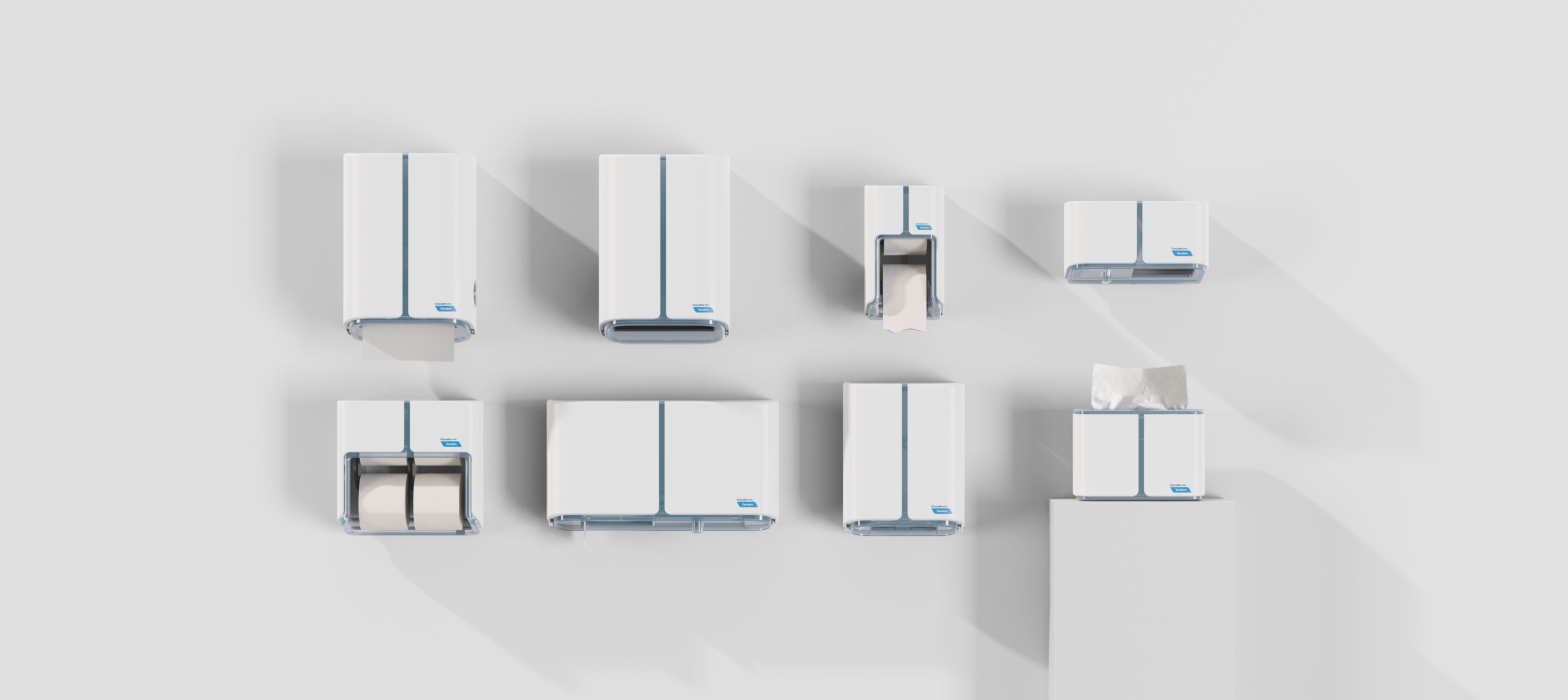
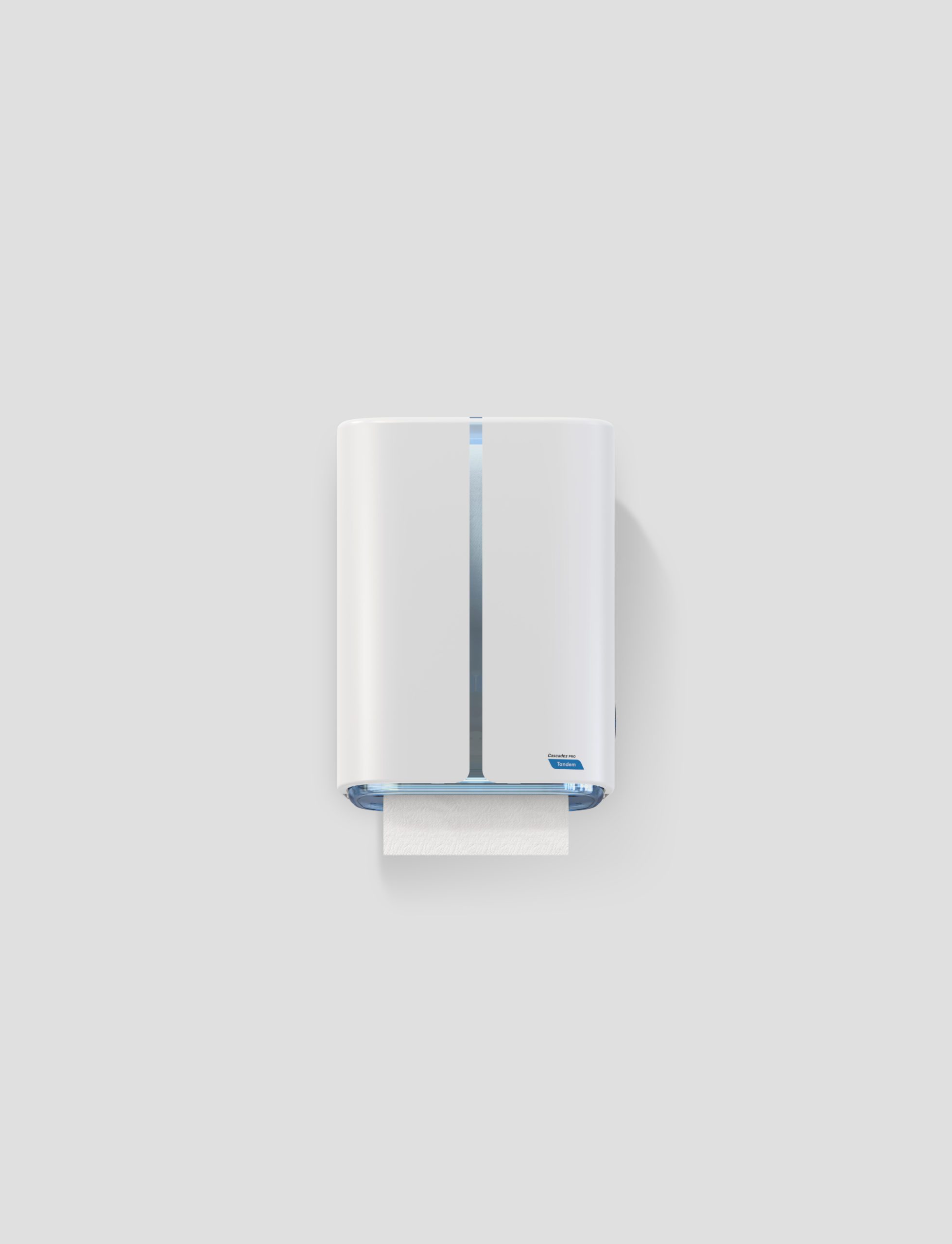
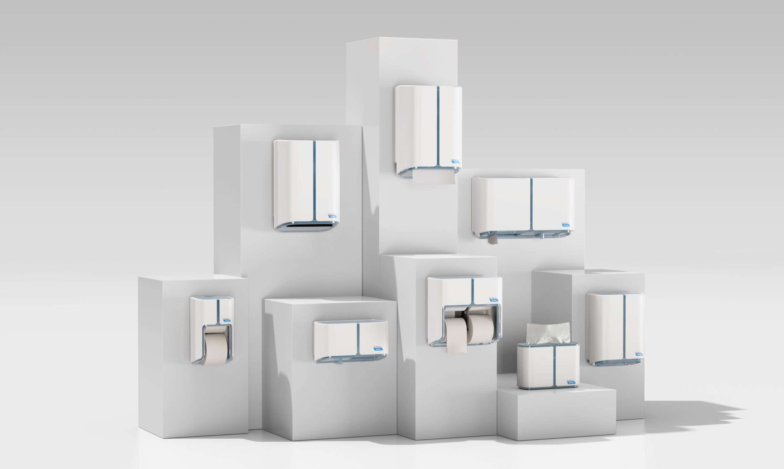
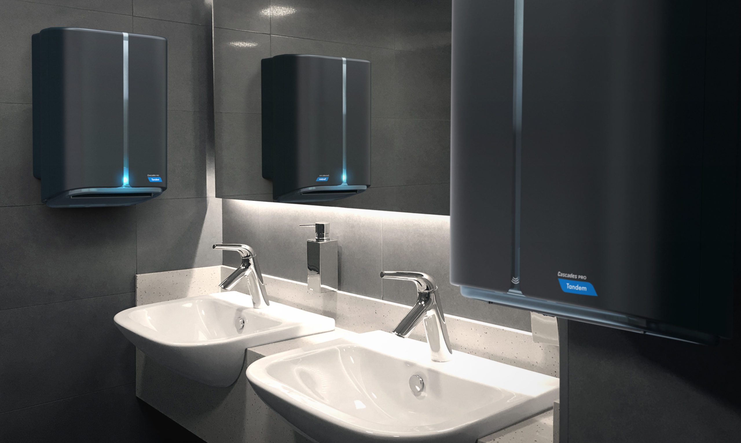
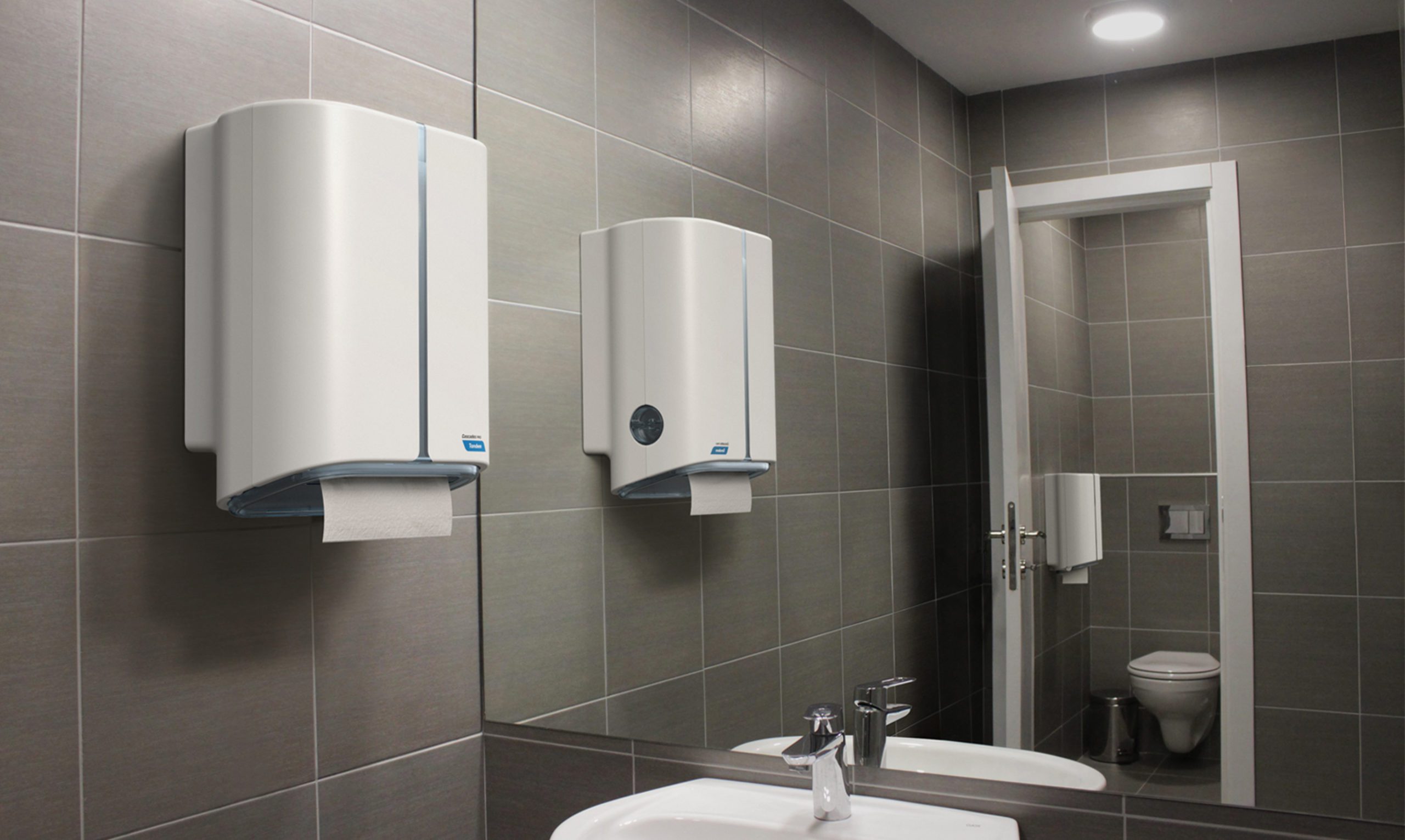
Cascades Pro Tandem dispensers
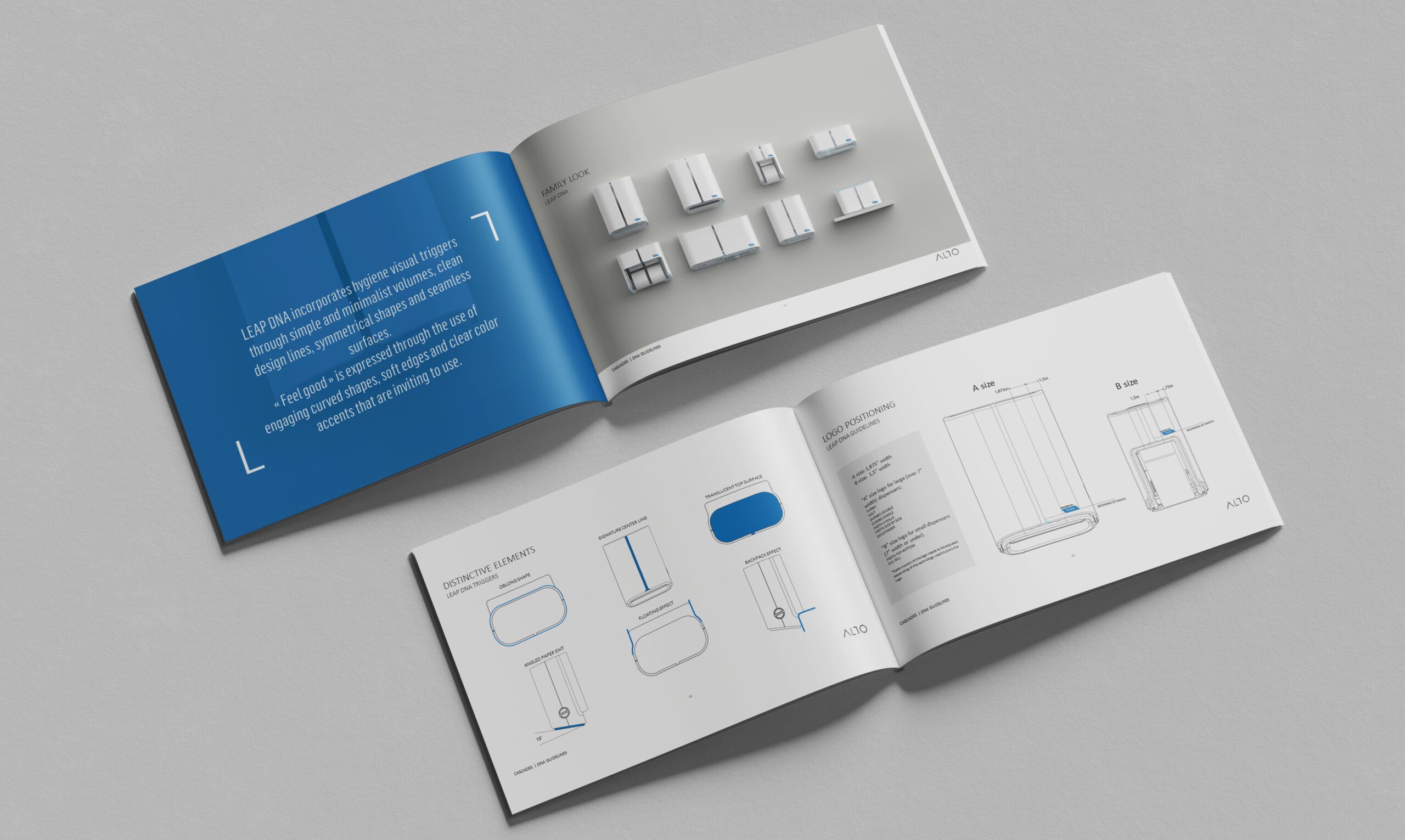
Paper dispensers product line
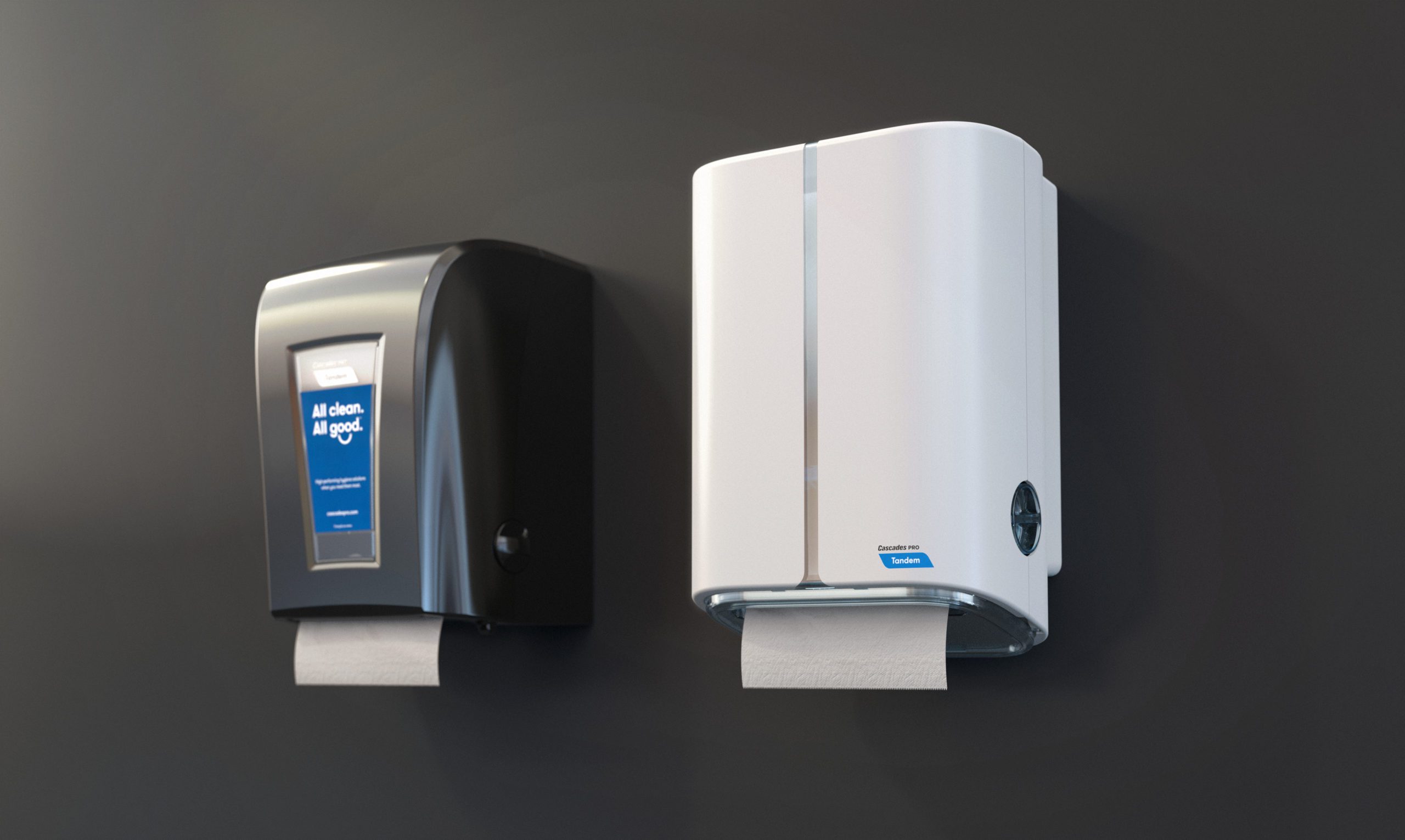
Following a change in brand positioning, Cascades commissioned us to redesign its line of Tandem paper dispensers to embody the company’s new signature: “All Clean. All Good.”
The concepts of hygiene and well-being, conveyed by the new brand identity, served as guiding principles for the renewal of the various paper dispensers.
“All clean, All good”
A comprehensive semantic approach helped pinpoint the most promising areas in the competitive environment and identified the various formal supports we should employ. These supports were then translated into the various components, generating the visual language employed in the development phase.
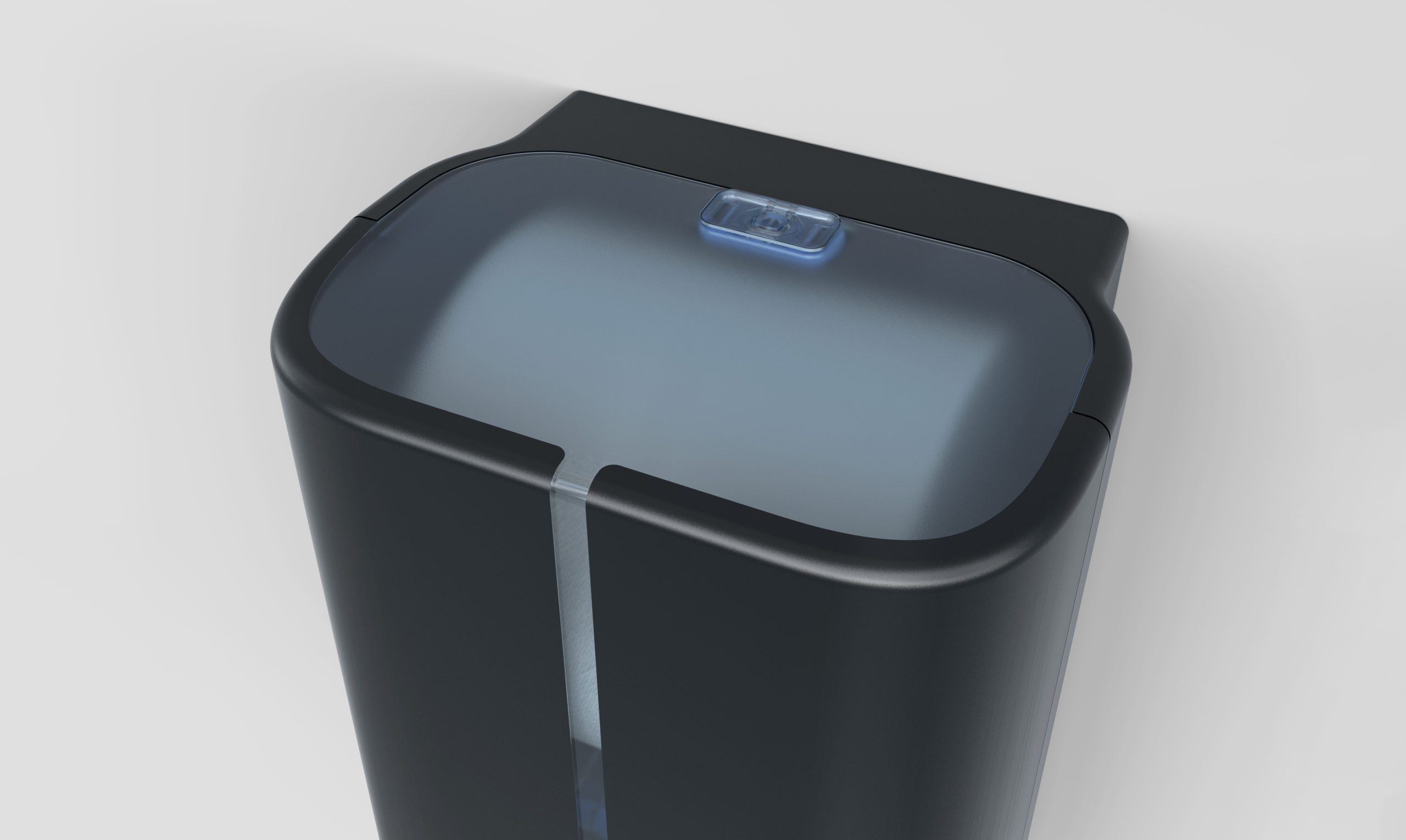
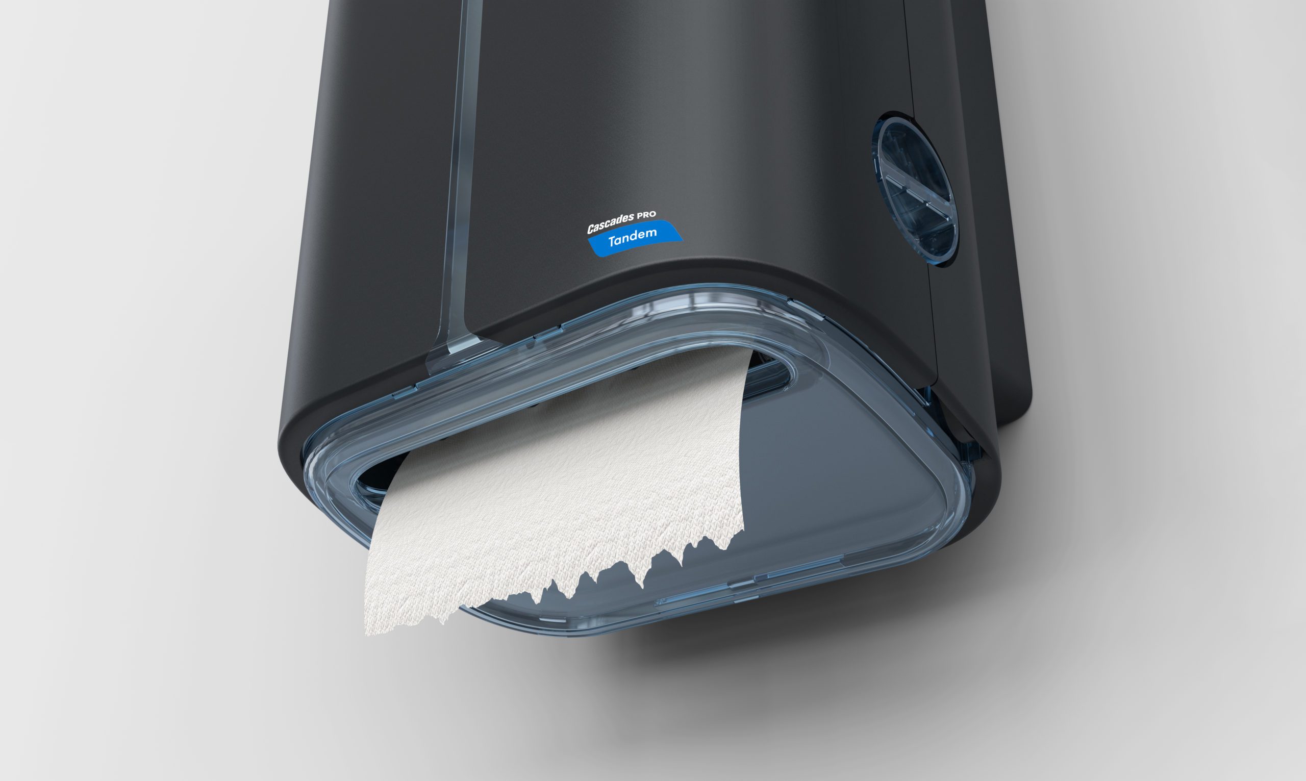
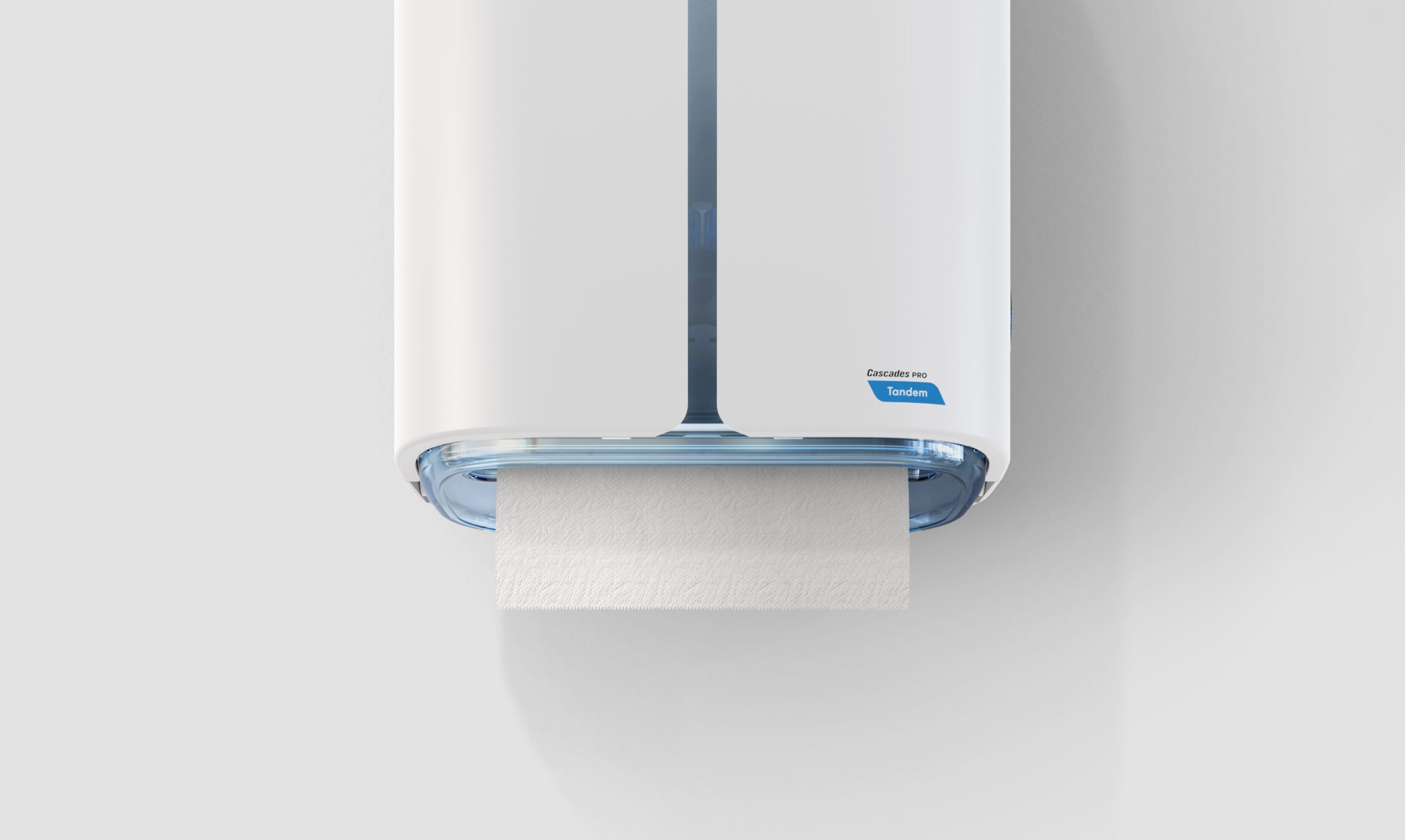
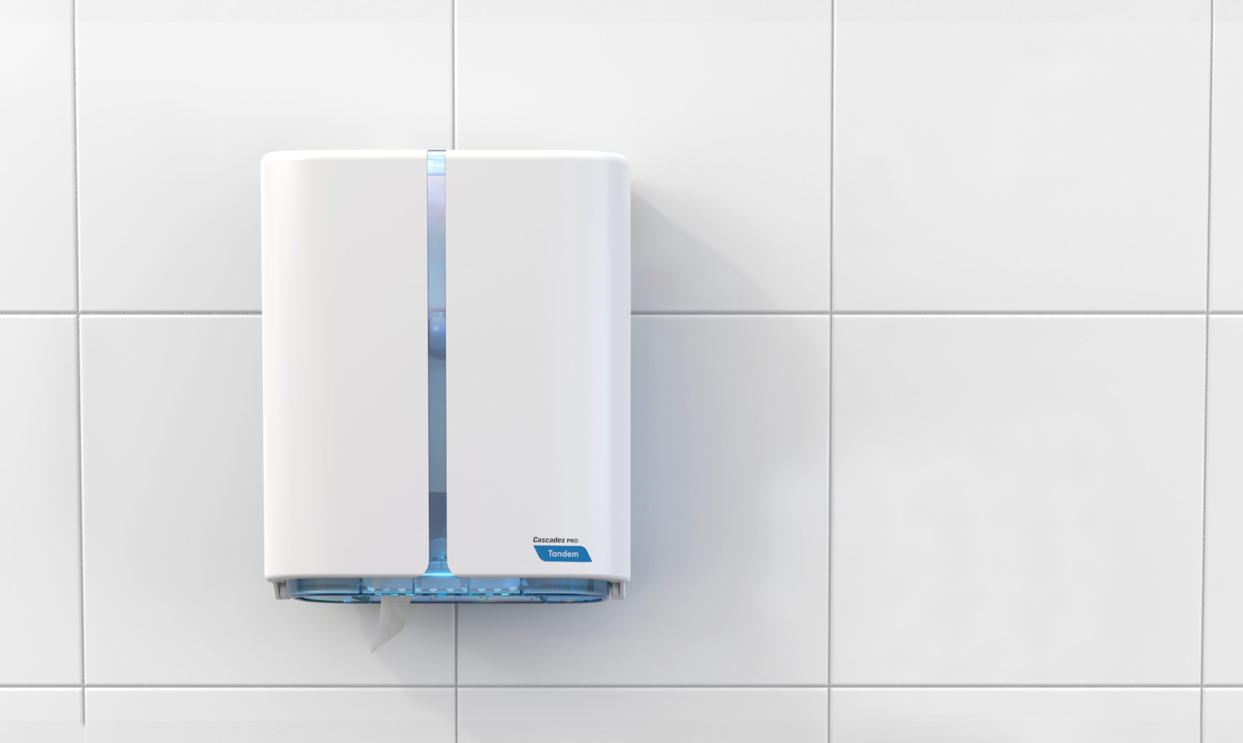
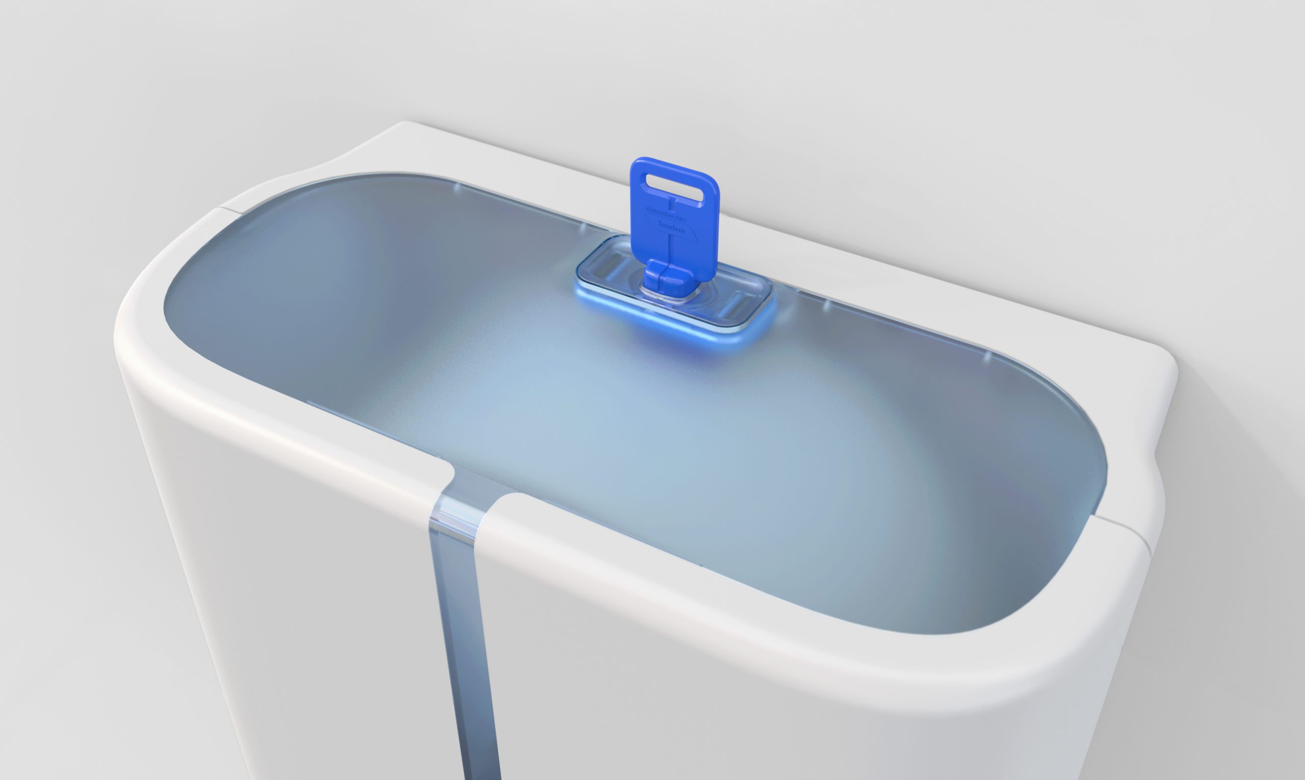
The resulting design expresses the concepts of hygiene and cleanliness through the round-edged rectangular outlines of the dispensers, as well as lightness and well-being suggested by the blue-coloured and transparent details. The product line’s simple, streamlined aesthetics allow every unit to settle easily into its environment and become a familiar, permanent fixture.
The translucent central line directs the user’s gaze towards the paper exit. Combined with the incoming light through the upper window, it also enables the user to see the remaining paper quantity without needing to open the casing.

Next projects